
Last week, Pantone declared Greenery their 2017 color of the year , and the Internet flooded with advice on how to wear, buy, use, and decorate with the verdant hue. But Pantone is far from the only paint company to name an annual shade: Benjamin Moore's pick was revealed with much fanfare a few months ago, and a handful of other color experts have called out additional shades on the rise. To help you select the very best, AD has compiled several colors of the year into one useful guide.
Pantone: Greenery
Pantone looked to nature for its 2017 Color of the Year, Greenery. "This is the color of hopefulness, and of our connection to nature," explained Leatrice Eiseman, executive director of the Pantone Color Institute, in an interview with The New York Times . "It speaks to what we call the 're' words: regenerate, refresh, revitalize, renew." The revered paint company also took cues from the fashion industry to settle on their shade. Greens factored heavily in Pantone's annual Fashion Color Report , which highlighted kale as a hue of choice on many runways.
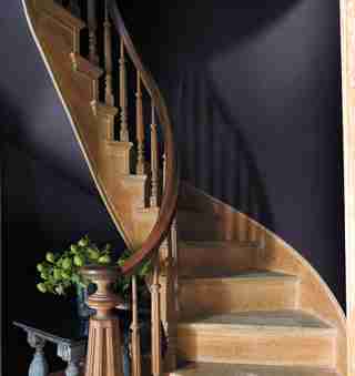
Benjamin Moore: Shadow
Benjamin Moore took a sharp turn from its 2016 pick, Simply White , to name this year's preferred color, Shadow. The company's creative director, Ellen O'Neill, calls it a usable, layered hue. "It’s dramatic," she explains, "which is what the year is. I’ve been over neutrals for a long time. I’ve seen people tiptoeing back to color for a few years, but for some reason it feels very right now. It’s more seductive."
Glidden: Byzantine Blue
Glidden's blue of choice is less a single hue than a combination of several trending colors. "It stretches the boundaries of purple to borrow all of best qualities of blue and gray, making it an appealing color choice for nearly any room,” explains Misty Yeomans, color marketing manager of Glidden paint.
Olympic Paints: Cloudberry
For Olympic Paints, this year's highlighted hue had to be about finding serenity and a sense of Zen in the everyday. "Cloudberry conveys retreat from the pressures of daily life, encouraging meditation and mindfulness, inspiring more focus and less stress,” says Dee Schlotter, senior color marketing manager for Olympic Paints. The shade pairs perfectly with a black-and-white scheme, as seen above.
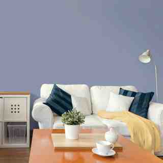
PPG: Violet Verbena
Similar to Pantone's Serenity and Rose Quartz picks last year, PPG's Violet Verbena is meant to symbolize a duality of thought. "Consumers now embrace the middle ground between masculine and feminine, young and old, and work and leisure," says Schlotter. "Violet Verbena’s blending of gray and violet reflects that middle ground."
Behr: Comfortable
In lieu of selecting one star shade, Behr broke down its 2017 color trends into three categories. The first, Comfortable, is a suite of muted shades meant to calm and, yes, comfort.
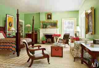
Behr: Composed
Its second group, Composed, comprises more dramatic, deeper hues, as shown in this bedroom.
Behr: Confident
Behr's final palette, Confident, is a mix of bold, bright hues, like the green used in this modern kitchen.
Sherwin Williams: Poised Taupe
Sherwin Williams's color of the year, Poised Taupe, is a deeper neutral than beige that still pairs well with brighter shades, like Greenery.