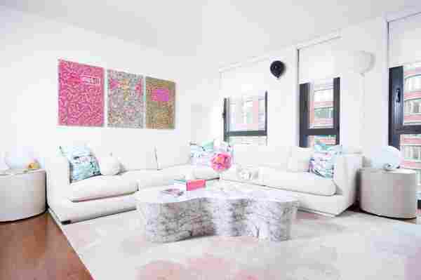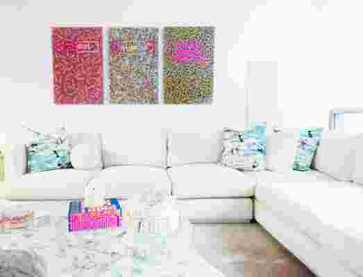


“My inspiration behind Robyn’s apartment was ROBYN! And of course her incredible art as well. When we first started working together, we discussed what she was looking to do. Her main objectives were that she wanted the space to be fun and grown up all in one, and she also wanted to make one of the bedrooms a home office. I wanted to take her personality, artwork, and love for color into account first and foremost!” Cara says.
Apartment Therapy Survey:
My Style: An eclectic mix of modern and contemporary, whimsical, bright, anything that makes you happy and brings a smile to your face.
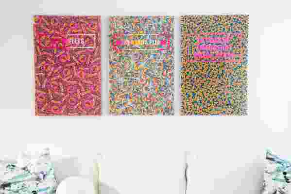
Inspiration: My artwork is inspired by indulgence, nostalgia, and color, so I wanted my space to reflect that while also remaining a blank canvas for my artwork to flow through as I create new pieces.
Favorite Element: My favorite piece in my apartment is my Gobi Chair from Nathan Anthony. The material feels like a Teddy bear and it has so much character, but still fits in with the clean palate of the room. Cara convinced me to place it on the edge of the living room right outside the entrance to my bedroom facing in—I never would have thought to put a chair there! I can sit in this spot and see my art up on the wall while also being able to look out of the window and take in the energy of NYC. It’s my favorite spot in the entire apartment.
Biggest Challenge : I tend to get carried away with color and patterns, which is great for my artwork, but not always for interior design for an entire space. Before I ever worked with an interior designer, my spaces tended to be a bit chaotic. When Cara came on for this project, I’d constantly suggest more prints and colorful elements, so she helped streamline the ideas in my head into a cohesive, neutral space with pops of color.
Proudest DIY : My Dots Desk! Once we picked out my office chairs, I thought it would be fun to make a custom desk in one of my signature prints. It’s such a standout piece in my office and always a conversation starter.
Best Advice: Cara – Try and add something playful in your space, and try to take a risk. It usually pays off and makes things a bit more interesting! For Robyn’s apartment, I had selected two Flos table lamps for the living room. To change it up, I did them in different metal finishes, which is playful and fun! One was done in a polished chrome finish and the other in a polished brass finish. So many people are afraid to mix finishes together but when executed the right way it can make a beautiful impact on your design!
Resources
“One of the reasons we chose Nathan Anthony for the major furniture pieces was that all of their stuff is really customizable, which is ideal for a smaller NYC apartment. For example, the pink Chelle chairs were modified to be slightly smaller in scale to fit in her home office space. Originally these chairs that they offered had a decorative design on the outside of them that we removed and created a much sleeker look,” explains Cara.
LIVING ROOM
Radly 3-Piece Sectional – Nathan Anthony
Cloudscape Rug – West Elm
Coffee Table – Sun Pan
Gobi Chair – Nathan Anthony
Side Tables – Restoration Hardware
Candy Artwork – by robynblair
Lamps – Flos
Bar stools – CB2
Coffee Table Books – Ann Sandra
‘C’Mon Get Happy’ Painting – by Deborah Kass
‘Let The Good Times Roll’ Painting – by Jojo Anavim
‘Smiley Face’ Painting – by Jimmy Paintz
Balloon Art – Sivan Sternbach
Cake Dome – Ann Sandra
OFFICE
Dots Desk — by robynblair
Chelle Swivel Chairs – Nathan Anthony
Acrylic Gallery Frames – Pottery Barn
Candy Dishes – by robynblair
Candy Jars – Crate & Barrel
Rug – Houzz
BEDROOM
Z3 Bed — Nathan Anthony
‘Stay In Bed’ Neon Sign – NAME GLO
Lamp – Umbra
Dresser – CB2
Sunset Lake Rug – West Elm
Thanks Robyn!
Share Your Style:
⇒ House Tour & House Call Submission Form
See More: ⇒ Recent House Tours ⇒ House Tours on Pinterest
