This article originally appeared in the January 2009 issue of Architectural Digest.
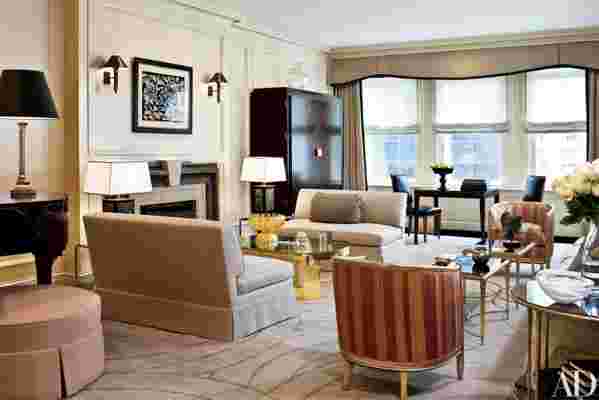
Like a Noël Coward play, the residence had a distinctly 1930s elegance. Set high above Park Avenue, this classic prewar apartment, in the parlance of Manhattan real estate, was designed for entertaining of the most sophisticated sort. From its expansive, beautifully proportioned reception rooms to its tiny maids' quarters, it seemed tailor-made for a stylish life.
But then the 21st century arrived. Whereas the current owners appreciate a sophisticated environment just as much as their earlier counterparts did, they'd be the first to admit, quite happily, that the lives they lead have, at times, more to do with Cheerios than champagne. "It's wonderful to have a pretty apartment, but it has to be functional," as the wife puts it. "Two kids live here."
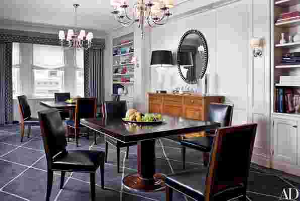
The owners turned to the architectural firm Ferguson & Shamamian to update the space yet retain, even enhance, its quintessential New York elegance. "Our mandate was to make the apartment more livable," says architect Mark Ferguson. "We modernized a 70-year-old apartment into something that a young, modern family would feel comfortable using."
The architectural team, which included Scott J. Sottile and M. Damian Samora, made extensive changes to what Ferguson terms the apartment's "hierarchy of use"—all while respecting its classic Georgian interior. They transformed some of its grander spaces into more practical, multipurpose areas, reconfiguring the kitchen and master suite, where the floor plan seemed antediluvian.


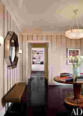
They worked "hand in glove," Ferguson says, with interior designer Sandra Nunnerley, with whom they'd joined forces before. The success of their collaboration is apparent from the very first room. The architects squared off the once-rectangular entrance hall—which Nunnerley refers to as "a pausing point"—allocating the remaining square footage to a much-needed coat closet and powder room. Like other refinements, the entrance hall's circular inscribed ceiling seems inevitable, somehow, as if it should have been there all along. Nunnerley echoed its dramatic swirl in the Swedish alabaster light beneath it and, below that, in a stunning Biedermeier table, made by Josef Danhauser in 1820s Vienna. An octagonal 1960s-era pewter-and-brass mirror, formerly owned by the fashion designer Pierre Cardin, is complemented by the strong verticality of the striped wallcovering, with its silvery lines.
This room, and those that follow, are relatively spare. Art on the walls—including the couple's growing photography collection—is placed restrainedly, with lots of space between. "I like it clean and simple," the wife says. "I'm just not a fussy person."
