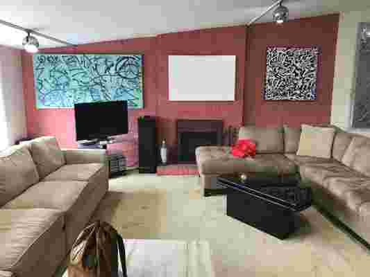
Recalling the state of his Brooklyn apartment in 2017—the year he and his husband, Nathan Lump , became its newest owners— Charles Runnette doesn’t mince words. “It was a terrifying wreck,” he says. The Cobble Hill two-bedroom, untouched since the ’70s, featured mismatched flooring , dark wood cabinetry, and a color scheme that ranged from brick red to bright turquoise. Still, its potential shone through. (A sizable terrace , situated off the living room, didn’t hurt its case, either.)

Before: A disjointed living room (once dominated by the “world’s largest sofas”) made for a common area that was far from cozy.
Following its purchase, the couple tasked Andrea Fisk and Jess Thomas of Shapeless Studio with a top-to-bottom transformation of the apartment’s 1,250 square feet. In addition to reconfiguring the layout to include a larger kitchen and bathroom, the designers added a powder room, entryway , and walk-in closet . A midcentury palette dictated early discussions about aesthetics, driving the team toward an assortment of natural wood finishes; a series of skylights was installed to flood the space with light.

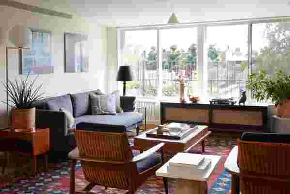
After: The living room is anchored by a Joybird sofa upholstered in a pet-friendly fabric for resident pooch, Marco. (The room’s artwork includes a painting by Whitney Bedford and photographs by Zoe Crosher , both friends of the couple.)
But it was the couple’s passion for adventure—Charles is a travel writer and filmmaker; Nathan is the former editor-in-chief of Travel + Leisure —that inspired some of the apartment’s most memorable details. “Our last home was very Scandinavian ,” Nathan says. “We love that aesthetic and part of the world. But this time, we wanted to bring in a more diverse set of design ideas and influences.”

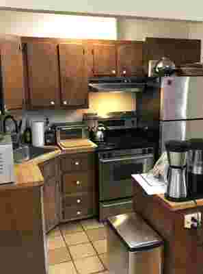
Before: The kitchen—with its crowded layout, dark wooden cabinetry, and lack of natural light—was ill-suited to the couple’s cooking needs.
After: Gray marble, with constellation-like veining, is an unusual—and effective—counterpart to the kitchen’s warm walnut cabinetry.
Accordingly, the space is filled with details that call to mind some of the pair’s favorite destinations: Shoji screen pocket doors nod to Japan; tadelakt plaster in the bathroom, Morocco; a modern application of marble and limestone, Italy. What’s more, the greenery-filled terrace has become an outdoor escape that to Charles, a former Californian, feels reminiscent of the Golden State.
Before: While bleak, the exposed terrace was a major selling point for the couple when they first came across the apartment.
After: Brooklyn landscaping firm Elevations turned the once-bare terrace into a verdant oasis. Marco takes in the view.
For a couple so often on the road, the newly designed apartment provides an ideal place to land, and to enjoy the city—and the quintessentially New York neighborhood—they’ve chosen as their home. “We’ve both lived in New York for over 20 years each,” Charles says. “This represents everything we ever wanted.”
Before: The apartment’s turquoise-tiled bathroom was too small to accommodate the large, luxurious shower Charles and Nathan dreamed of.
After: Nathan’s favorite feature of the finished apartment is its spacious, skylit shower. It’s “as close to an outdoor shower as you can get in NYC,” he says. “Plus, it’s super convenient for giving the dog a bath!”
Andrea and Jess designed cubby-like shelves with the couple’s collection of travel souvenirs in mind.
Open shelving puts Nathan and Charles’s ceramic collection on full display, alongside paintings by artist Eric Doeringer .
The redesigned living room features an antique Turkish kilim rug, a midcentury Danish ottoman, and a custom limestone fireplace.
A well-appointed corner bar (with hidden wine fridge) contains echoes of the kitchen’s polished aesthetic.
"I love that you cannot see the street from any of the windows in our apartment,” says Nathan. “It gives the place such a feeling of seclusion from the busy-ness of the city. It’s like a zen aerie in the sky.”
