
Walk into any recently renovated home today and chances are you’ll see a lot of greige —a neutral color that’s the perfect combination of gray and beige. There’s no denying it’s the paint color du jour. It’s funny how, oftentimes, you can instantly pinpoint how modern (or not) a room is just by looking at the color of the walls. Some day our children might look back and wonder why we all plastered our walls in such a boring color! In fact, a recent survey suggests the tides could already be changing.
So what will take its place? Like fashion trends, home decor tends to be cyclical, so let’s hop in a time machine and take a look at the most popular paint colors by decade.
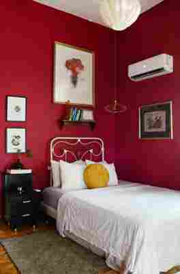
1940s: Red
As World War II came to an end, homeowners were entertaining more again. They wanted fun, lively spaces. Enter red, a hue that continues to be popular today, says Rachel Skafidas, a senior color designer for Krylon.
If you’re looking to add a pop of red to your space, try Krylon Cherry Red .
1950s: Turquoise (or Mint)
“The time of growth and optimism during the 1950s translated into a palette of pastels at home,” says Sue Kim, senior color designer for Valspar Paint. “A light turquoise celebrated the connection to nature and provided a colorful backdrop for mid-century decor with a heavy wood finish.”
If you’re looking to add a pop of turquoise to your space, try Valspar Gentle Wave .
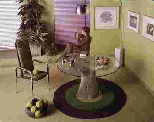
1960s: Vibrant Green
“The 1960s sparked a new era around the world and in American culture. Technology was changing and social habits were shifting,” says Ashley Banbury, a senior designer for HGTV HOME by Sherwin-Williams. “Our focus turned to a younger generation who set their own rules and campaigned for a world full of peace and love. We became intrigued with everything London—from interior design to fashion. And the American Pop Art scene took off and centered around Andy Warhol.” As a result, the colors of the 1960s were similar to the previous decade—but more vibrant and intense, says Banbury. “Inspired by nature and the Pop Art movement, green, red, yellow, and orange were popular shades that combined to create an intense contrast.”
If you’re looking to add a pop of green to your space, try HGTV Home by Sherwin-Williams Talipot Palm from the Vintage Finds Color Collection.
1970s: Mossy Green
“As the 1970s celebrated ‘mod’ style and vision for the future, decor colors focused on bright and fun shades,” says Kim. “To build a backdrop for this strong design direction, a color such as this calming mossy green would have harmonized the space.” It was a popular choice for everything from textiles and wallpapers in living rooms to kitchen cabinets, she says.
If you’re looking to add a pop of mossy green to your space, try Valspar Dusty Olive .
1980s: Mauve
“The 1980s marked one of the first movements of self-improvement. Aerobics videos were becoming popular, and television series like ‘Lifestyles of the Rich and Famous’ showed us a life of glamour through big hair and fashion,” says Banbury. “There was a much more soft approach to interior design with floral patterns and textiles. And mauve was the defining color accented with shades of green.”
If you’re looking to add a pop of mauve to your space, try HGTV Home by Sherwin-Williams Temperate Taupe .
1990s: Purple
The ’90s was a decade of optimism flanked by two decades of uncertainty, says Skafidas. You see that air of happiness reflected in color choices: Purple and pink tones took center stage, as did other bright hues like pink, yellow, and aqua.
If you’re looking to add a pop of purple to your space, try Krylon Gloss Gum Drop .
2000s: Pale Blue
The turn of the 21st century was a time when many people seized the opportunity to reset and adjust priorities. “Kitchens were opened up during this decade as walls were knocked down to accommodate new floor plan preferences, and new home construction was on the upswing,” says Kim. As a result, color choices were subtle and simple. Shades like pale blue were popular in many master bedrooms, especially in spa bathrooms.
If you’re looking to add a pop of pale blue to your space, try Valspar Destiny .
2010s: Gray
At the beginning of the decade in 2010, the country was still recovering from a recession and some of the optimism from previous decades waned, says Banbury. “The colors in homes shifted to gray, from stainless steel appliances to the colors on walls.”
If you’re looking to add a pop of gray to your space, try Sherwin-Williams Chatroom .
Related:
Trend-Proof Decorating: Classic Paint Colors That’ll Stand the Test of Time
10 Paint Colors With Cult Followings