Situated on the first floor of a three-story Victorian home, in the vibrant and creative neighborhood of Jamaica Plain in Boston, Massachusetts, this kitchen took seven months—from design to completion—to reveal its new look. “It serves as the first space you see and interact with when you enter the home,” says Sashya Thind, founder of ID8 Design Studio .

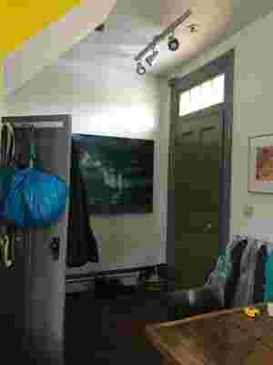
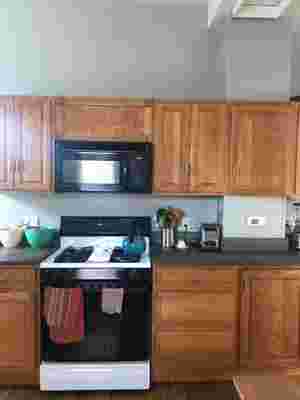
BEFORE : The space had a lot of potential but was lacking in light and coziness.

BEFORE : The empty space above the cabinets proved to be ideal for expanding storage.

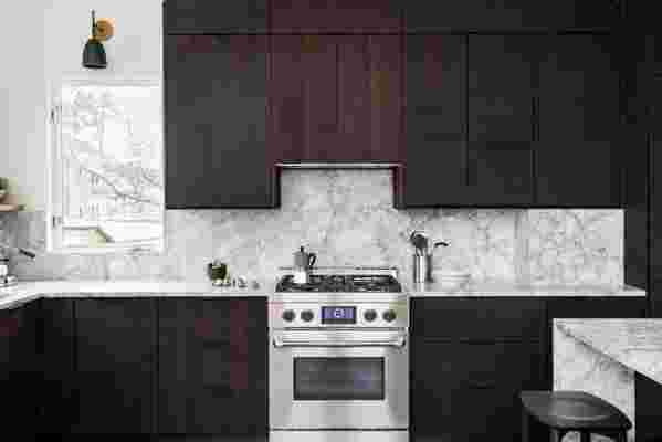
AFTER : ID8 Design Studio banked all the cabinets together to allow the windows to have room to breathe around them.
Designed for a couple with two girls, the U-shaped kitchen had a few challenges that Sashya used to her advantage. For example, the existing Morsø stove , which was initially surrounded by an oversized chimney breast, was shaved down to a size that allowed for more space for the counter and dark cabinets. “The cabinets wrap around to create an L,” Sashya says. “The refrigerator and pantry are in the narrower section while the main prep counter, sink, and cooktop are in the more accessible area. We also made a little breakfast counter with stools for the girls in the morning.”
AFTER : The existing Morsø stove , which had an oversized chimney breast, was shaved down to create more space for the dining and kitchen dark cabinets, playing off the industrial nature of the stove.
AFTER : Windows are now bigger to increase the amount of natural light, and Sashya and her team designed the mudroom bench by the wood stove. “I can totally see the experience of leaning against the chimney with your legs outstretched, looking out the window across or reading a book,” Sashya says. “It’s a very special spot—warm, cozy, and inviting—when dinner is being prepared in the evening while the stove is on.”
AFTER : The very compelling painting Burn Out by the client, Joe Wardwell , was the jumping-off point for the green Sashya introduced in the floors . This color ties the rest of the house together as the couple had previously renovated the bathrooms on the upper floors with a green tone. “It sets it apart and is closely connected to the clients’ art collection,” Sashya adds.
For the designer, one of the main objectives was to give life to an inviting space while maintaining a sense of order. “There is intentionally tension in the palette,” she confesses. “The sawn oak cabinets are rough while the quartzite counters are stark. In contrast, the bottle green heated floor tiles feel like a piazza in Italy, where the family spend their summers.”
The new kitchen has textures and features materials with character in a casual atmosphere, which reflects warm minimalism. “We don’t live as formally as we once did. I believe in usable yet beautiful spaces,” Sashya says. “The black accents in the hardware , lighting, and cabinetry were all concepts that stemmed from the stove finish. The client loved the black, which is quite unusual, so here we had the opportunity to be more artistic and create something unique for them.”
