How do you renovate a 1920s bungalow and still make it feel fresh, timeless, and modern? That was the challenge Caitlin Murray of Black Lacquer Design faced when hired by an Aussie couple looking to revamp their Silver Lake home. Though they were initially drawn to a more contemporary aesthetic, Caitlin preferred to let the architecture lead the design. “For me, it’s always pretty clear what they are not doing right away,” she says.
The kitchen, in particular, needed a major upgrade with modern touches that respected the home’s architectural details—out with the pieced-together early-2000s remodel and in with custom cabinetry, warm walls, and curated vintage additions. At first the couple wanted to go with a neutral kitchen, but the designer, who is known for her eclectic, colorful projects, encouraged them to embrace the bold. “I try to get the best answer for each individual space and find my clients want to be pushed a bit,” Caitlin says. “I think maybe it was because of the pandemic, but comfortable and cozy neutrals have been trending, so I think my work jumped out because it’s different from what’s out there.”
Kitchen location: Silver Lake, Los Angeles, California

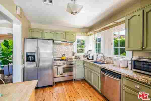
BEFORE: The kitchen had ornate cabinetry, a tiled backsplash, and a dysfunctional design.
The before: “It was like a Craftsman Home Depot special,” recalls the designer. The kitchen wasn’t original, was most likely remodeled 20 years ago, and had dated cabinetry and basic granite countertops. “In historic homes, it’s hard to tell what the original floor plan was, as kitchens have come a long way,” she says. There were “wonky corners and none of the moldings were the same height,” almost as if “it was a rental where they slapped on coats of paint,” she says.
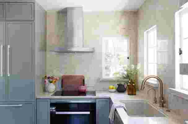
The inspiration: When Caitlin starts a project, she likes to find a totem, “a guiding point for the rest of the space that often comes by way of the palette,” she says. For kitchens and bathrooms, that totem is stone. During a trip to the stone yards, she showed the homeowners a variety of quartzite slabs, which are nearly as hard as granite, don’t scratch like marble, and have a range of natural patterns and texture. To allow for more storage and “not detract from the stone,” Caitlin created floating shelves out of the quartzite and added ledges onto the existing central windows.
Square footage: 130 square feet

AFTER: Instead of Shaker-style cabinets, Caitlin chose a flat cabinet but applied trim for a look that marries Shaker with modern flat panels. She also swapped traditional appliance pulls for oversized cabinet hardware in a high-gloss white. “I like mixing metals and finishes,” she says. By not using brass on the appliances, it makes the faucet pop.
Main Ingredients
Countertops: Quartzite
Cabinetry: Custom
Paint color: Farrow & Ball Lichen
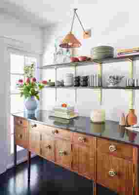
Sideboard: Vintage
Floating shelves: Prefabricated from Rejuvenation

Caitlin demolished the closet holding the washer and dryer and replaced it with a built-in pantry. And instead of adding cabinetry butting up to the windows, a vintage casepiece and shelving create a functional and decorative area on one side of the room.
Most insane splurge: The appliances were one of the biggest splurges, as Caitlin went with Miele .
Sneakiest save: The plumbing fixtures, which pair well with the more costly items in the kitchen, are from Delta .
Favorite part: “I love the way the vintage buffet balances out the modern lines of the cabinetry and the appliances,” she says. “That, to me, really helped achieve the balance of modern craftsmanship. I think it’s always important to use things from older eras when working on a historic home.” She also loves the prefabricated Rejuvenation shelves. “I thought they were perfect,” she says. “I wanted to bring in more of the brass tone to mimic the hardware on the buffet.”
What I’d never do again: Luckily, the kitchen remodel turned out as planned. “That is the benefit of working in a small space—you can really spend a lot of time going deep and making sure that every detail is accounted for,” she says.
Final bill: $85,000
