A quick Pinterest search or conversation with a decorator will tell you 2018 is going to be quite the throwback year design-wise. Specifically, the ’70s and ’80s are surging, and two of those decades’ close-cousin decorative motifs—terrazzo and anything Memphis style—are bubbling up to the surface.
These aesthetics have been re-trending in the high-end market for the past few years now, but when Target or Urban Outfitters start stocking these styles, it’s officially on . And you know what, people are taking more risks with these motifs, too, and things are skewing more modern and neutral, meaning less kitschy and loud (to settle the fears of anyone who has already started twitching at the thought).
Terrazzo
Donna Mondi swears that terrazzo is the next big thing. What started as a flooring material is now making its way into the kitchen, onto fireplace surrounds, sinks, lamps and even onto soft goods (as a pattern).

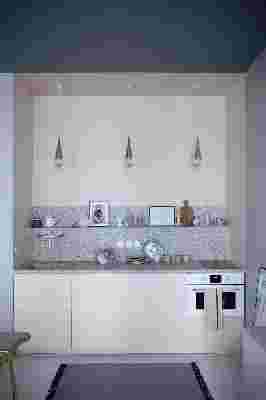
This kitchen , in a gorgeous apartment above Marie-Sixtine in Paris, is basically what my Millennial Pink dreams are made of. This fleck patterning is on the smaller side, which might be the way to do this if you’re on the fence about going for a trendy, of-the-moment material on its comeback tour.
This same apartment also boasts gorgeous terrazzo tile in the bathroom which looks strikingly modern in these large pieces. Even if this amount of terrazzo is not in the cards for your bathroom, one hit of this material on a sink, for example, could be a fun upgrade that can be more easily changed out if you tire of it.
Terrazzo tables and pieces of furniture are becoming more common at lower, non-custom price points, too. This table’s black colorway, in a room designed by BLOOC via The Design Chaser , looks modern and chic but not as loud as if, say, the flecks were bright colored.
If, however, you can’t help but love color, take a gander at this lovely terrazzo sink (paired delightfully with black-and-white checker terrazzo floors, because, why not?), in a bathroom of a guest suite at The Siren Hotel in Detroit.
How do you bring this look home if you’re not remodeling? Easy. Grab one of these terrazzo-inspired home accents:
Memphis Style
Changing gears, there’s also Memphis Style to discuss, which Christiane Lemieux of The Inside tells me is going to be all the rage this year. Thus far, this style has been a little kitschy—bright colors, lots of graphic lines, squiggle patterns—think quintessential ’80s.
All graphic everything, Memphis in the case of this bedroom by Dulux pretty much means technicolor, too.
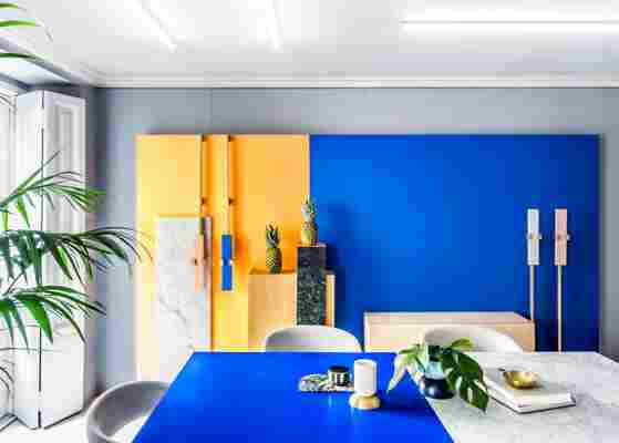
Creative consultancy brand Masquespacio used their signature aesthetic (a nod to the bright colors and geometric forms used by the 1980s Memphis Group ) for the design of its studio in Valencia, Spain. This image (and the photo in the lead of this post) were both featured in the tour of the space on Dezeen .
Hyper-designed is how I would describe this Memphis setup via Fresh Design Pedia . It’s basically like living in a Mondrian.
But this bathroom, designed by Andrea Marcante and Adelaide Testa for UdA Architecture and Interior Design is a slightly different animal. The lines and angles are all there, but the palette is chalkier, and the overall mix looks a little fresher and more today.
So that’s where I think Memphis is potentially headed—into neutral territory, especially if today’s home goods market is any indicator. Check out this bunch of Memphis-inspired goodies.
What do you think? Are these styles still too ’80s for you or so right now?
