This article originally appeared in the February 2007 issue of Architectural Digest.
Like Cinderella, there are once-upon-a-time houses that undergo a complete transformation from the plain and barefooted to the beautiful and high-heeled. Or, as the architect Robert A. M. Stern explains about his renovations: "Every now and again we put on the glass slipper."
Before the ball, a couple's house on Martha's Vineyard was a rambling affair caught in a confusing identity crisis somewhere between modern loft, traditional barn, ranch house and Shingle Style cottage. Two wings—one for bedrooms and the other for an all-in-one living room, dining room and kitchen—angled off from a center that did not hold: "There was nothing welcoming," says Stern's partner in charge, Randy Correll. "You had to figure out where the front door was."
It was a house with plenty of square footage and volume but no magic. It lacked character and focus; the composition was weak and the moldings thin. The cumulative effect was that in 20 acres of scrub oak forest, it didn't have the presence to carry the site—not enough architectural stature for the spread. "Often we just recommend taking a house down, but this one was a relatively new structure, from the late 1980s or early 1990s, and it seemed criminal to demolish it," says Correll.
"We liked the footprint," says the wife. "And we saw the potential. It had a great room with a big kitchen. I thought Bob could make it into a Stern house. I've admired his work for years."
However, the deep make-over required more than a quick stroke of a magic pencil. It took three years and three phases to complete, with time out for the summers that the couple and their children, two dogs and cat spend here. The bedroom wing was the first to be remodeled, then the living room wing, and finally the entrance in between, which the architects expanded to include a second floor.
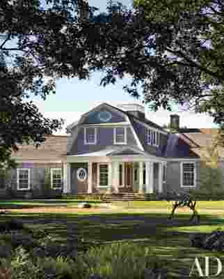
The result is a generous, white-trimmed Shingle Style house with wings that hold the site while bracketing a two-story entrance structure, very much a house within a house. The entrance is no longer a weak hyphen between parts but a boldly detailed centerpiece that binds the composition together in a clear hierarchy.


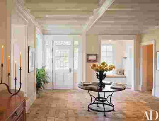
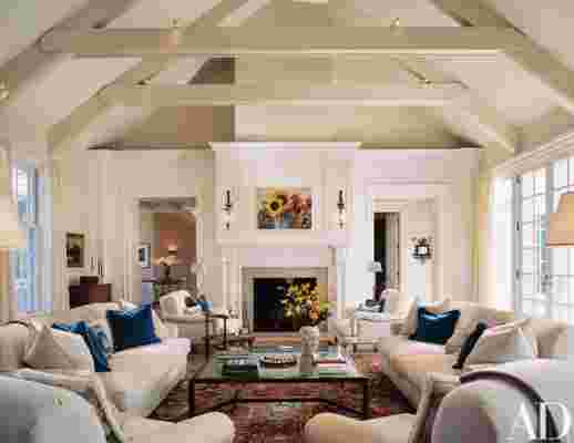
Stern and Correll started the transformation by reorganizing the great room into discrete units. They borrowed space from the end of the barn-like interior to create what Stern calls a "proper kitchen" closed off from the living area. Off the kitchen, they added an octagonal dining room, with windows fanning 270 degrees across the landscape, offering a view of a new pool and poolhouse. The architects tied the dining room, living room, entrance hall and adjacent library together with doorways that open one space into the other in a gracious processional sequence. Each room is separate, but the lineup confers the sense of a whole greater than the sum of the parts.
