With a client list that includes top chefs such as Cesare Casella and Daniel Boulud, and a portfolio filled with kitchen designs for Michelin-starred restaurants, designer Stephanie Goto has positioned herself at the intersection of two of her favorite things: food and design. So when she creates a kitchen—whether for a star chef like Boulud or for a serious foodie who frequented just about every Manhattan culinary mainstay—the concept is about much more than aesthetics. “A kitchen design is very personal,” Goto says. “It’s like getting dressed in the morning. You want certain things at an arm’s reach for the maximum outcome.”
We caught up with Goto to get the scoop on exactly what chefs want in their home kitchens. The takeaway? Despite having a few more demands than the average homeowner (Boulud required a plancha and both gas and induction burners), they’re not all that different from the rest of us. “They ask the same questions we ask,” Goto laughs. “They’re interested in storage and functionality and where the sink should go.” So for your next big kitchen renovation, take these cues from the kitchens of top chefs—they might be a lot more applicable than you thought.

Place the sink first.
“We engage the sink the most out of any of the fixtures in our kitchen, so it needs to be placed first with functionality in mind. It should be positioned in a place where you have the maximum functionality adjacent to it. It never works when you don’t have a prep space nearby, so don’t put it directly next to another appliance, if possible. Because the sink is a dirty space, our clients also generally prefer deeper sinks so pots and dirty dishes can be concealed.”

Make the most of your kitchen island.
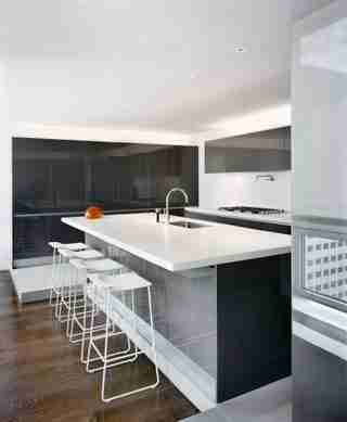
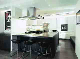
“As much as it is their day job, chefs love gathering people in their own kitchens, and the kitchen island is about that moment of gathering. It’s really the heart of the home. An island or peninsula that faces the dining room—as shown here in Daniel Boulud's kitchen—is a repeating design feature. If the owner prefers to be onstage when they’re cooking, that’s when it’s the right option to put the cooking surface on the island. For Cesare’s kitchen, the island is a geometric shape with many angles. When they first used the kitchen, he called me and said, ‘Wow! We can have seven people working in the kitchen at one time!’”

Choose hard-wearing surfaces.
“Surfaces and durability are things we bring up a lot. We absolutely love natural materials, but if there is heavy use, we lean toward fabricated materials like Caesarstone that allow a higher level of durability. They’ve really improved the color palette that’s available to designers, so when you get a high level of durability plus that palette, it becomes the right choice.”
Pair utilitarian appliances with refined cabinetry.
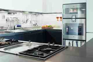
“People who are frequent cooks want to maintain something visually appealing. For this client—a New York City lawyer who has eaten at virtually every major restaurant in downtown Manhattan—it wasn’t about being a show kitchen, but a foodie’s kitchen. It’s very utilitarian—he wanted a heavy-duty Wolf stove—yet we took care in the selection of the finishes. The white cabinets are glass, and the gray cabinets are lacquer—they really play with materiality. This way, it’s not too precious or too utilitarian.”
Opt for invisible hardware.
“When you lean up against the counter, you don’t want to feel a handle poking into your side. You also want a clean surface where you really see the materiality of the surface. We’ve worked a lot with Dada and have been generally seeing less hardware and more integrated pulls or touch-to-open cabinetry. It makes working much more efficient.”
Use concealed storage.
“Maybe it’s our modern approach, but we design with concealed storage for the most part. With open shelving there’s a concern about dust, and there’s just less of a desire to showcase the interior of cabinetry. With our clients, the backdrop of the kitchen is something that is thought about often. What do you see beyond your kitchen? Do you really want to see a bunch of glasses and plates or just a beautiful white wall?”
RELATED: Get more kitchen renovations tips and ideas from AD .
