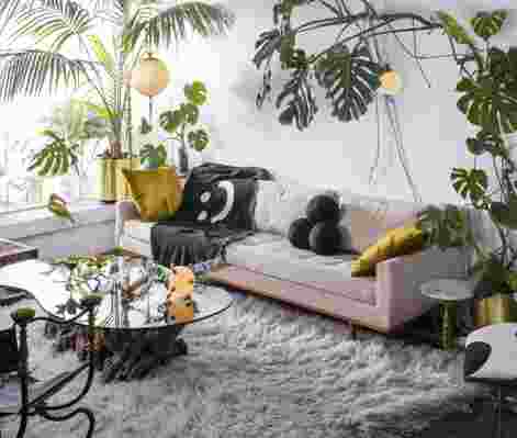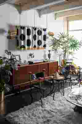


I had been looking for my very first home to renovate into a show home for my interior design style for several years before coming across this place. As a broke-ass first-time buyer, I was constantly getting knocked out of handshake deals by aggressive flippers eager to replace every original detail with whatever was on sale at a home improvement store. I came across this vintage villa in rough shape the morning it was listed and, of course, it had a cash offer from a flipper within a couple hours. Fortunately, I met some of the neighbors there and they urged the original owner to sell to me instead of letting it get trashed by a developer.
The house had awesome original details like arches, old amber bottle glass windows, and even a Juliet balcony hidden in the master closet that overlooks the den. It had lots of unsavory details too, like several layers of 1980s wallpaper and carpet around the FUCKING TOILET. In the bedroom I removed multiple layers of wallpaper and was left with a rough patina-ed texture that I ended up leaving as is.
I previously lived in a vintage apartment that I fully restored into a 1960s time capsule (without asking the landlord WHOOOOPS), and while I left my atomic sensibilities in the past, I kept the purist mentality of exclusively vintage furniture and decor. I still wanted the illusion of an untouched era-in-a-box, but this time I wanted it to be a bit more ambiguous.
My roommate, a bartender and musician, approached me about helping her transform her bedroom into a space also suited for entertaining people, making drinks, and making music. I completely redesigned the space in a supergraphic 1970s Greco-Asian style, featuring custom cabinetry, custom shelving to showcase her favorite liquor bottles as wall art, and a dual use bar, perfectly sized to her piano. The space became somewhat of a speakeasy and was given the name “Room Service” (my background is in graphic design with national awards for my hospitality branding work, so I couldn’t resist branding the space like a real bar with monogramed coasters and custom barware). It’s become our favorite spot for experimental cocktail sessions and impromptu music production. Some favorite details of the space include the custom brass signage, the sconce specifically designed to hold a dried rose, and the hand-painted striped concrete floor.
Apartment Therapy Survey:
Our Style: Supergraphic Regency is what I’ve been calling it, but it might already have a name and I just have no idea. It’s a dichotomy of huge minimalist black-and-white graphics and opulent gold antiques–like a vintage Versace scarf come to life.
Inspiration: My love for huge black and white graphics and patterns stemmed from my love of Japanese manga (comic books) as a kid. I draw inspiration from Gio Ponti, Swedish Grace, Versace and the Bauhaus, but I still like to sprinkle in irreverent hints of my Adult Swim-laden past.
Favorite Home Element : My favorite element of the home is definitely the fireplace. My home is the only home in our little stretch of vintage villas that retains the original fireplace. It boasted original burnt adobe brick, a quintessentially Arizona material, so instead of plastering over the whole thing I carved faux chips and cracks in the plaster to expose and honor the colorful brick beneath. When I was speaking with plasterers from Craigslist about the project I had a really tough time explaining how I wanted it to look “shitty.” I quickly realized that if I wanted it to look “shitty,” my extreme lack of experience would really come in handy, so I just did it myself. And BOY does it look “shitty.” During the winter I like to take naps on the hearth while roasting my tootsies by the fire and listening to music.
Biggest Challenge : I’m broke as hell. This home was vastly out of my budget, but perfect for showcasing my interior design style and custom pieces. I spend every last drop of my income and free time renovating this house myself, and BOY is it exhausting. As a result of designing on such an extreme budget, I’ve had to learn a TON about materials and fabrication. Now I exclusively drive cheap crappy old cars, meal prep with beans and rice every week, and hardly ever take vacations, but I know if I stick with it it’ll pay off.
Proudest DIY : The home featured some super shitty 1980s floor tile, in a color that really just cannot be described, but I couldn’t afford to replace it. I ended up paying to have some dudes from Craigslist come in and rip it all out (who obliterated several things throughout the house in the process) with the plan to paint the bare concrete with patio paint. Since I’m a big idiot and I guess a total masochist, I decided to hand paint five different colored layers on the entire floor, using only a sea sponge. This process took about six days straight of painting right when I woke up to until about midnight. The layers created a worn esoteric look that doesn’t show dirt (because it already looks dirty haha) and the sharp hand-painted neoclassical borders and giant dots helped to frame and contrast the texture. The paint holds up great, even with Disco blasting through the house at Mach 1 every two hours for god knows what reason.
Biggest Indulgence: I FUCKING LOVE CHAIRS AND I FUCKING LOVE LAMPS.
What’s your best home secret or advice? You don’t need to dig through an old barn or wait outside an estate sale for hours to get a good deal on a vintage piece. I’ve taken to picking on eBay. Just because it’s on eBay doesn’t mean the seller knows what it is or what it’s worth. You can catch some insane deals if you keep your eyes on the recently posted “Buy It Now” items. Best of all, you don’t have to get that “sorry someone offered more it’s sold” text halfway through driving 50 minutes to the middle of nowhere—once it’s officially sold on eBay, nobody’s gonna come in and rain on your parade.
What to people most get wrong about using color in their home? A lot of people don’t realize that wood grains and houseplants contribute to your home’s color palette. These pieces can provide huge swatches of color in your house and you gotta take them into account when planning out your mood boards.
What are the biggest tricks/secrets to using color in decor? Most people think that in order for color to have impact, you need to use a ton of it. In graphic design we sometimes use a very limited amount of a color against a neutral palette in order to make its presence infinitely more dramatic.
Favorite wall paint color of all time: I use Culture Hustle’s “Black 3.0” for most of my patterns and murals. It absorbs light and makes for some really rich blacks in photos.
Resources
PAINT & COLORS
Culture Hustle – Black 3.0 (Closest thing to Vantablack on the market!)
LIVING ROOM
Spiked Mace Lamp – Me ( Available for sale !)
Vintage tuxedo sofa – Craigslist ($100)
1880s Savonarola chairs – OfferUp
18 th Century sun lounger – Målefors Vintage Imports
Polka dot TV cover – Me
Smiley face throw blanket – Lazy Oaf
DEN
Abstract Ink Portrait – Cameron Zerambo
Nada Raad “Masque” bronze sculpture – Stair Galleries
DINING ROOM
1939 Gilbert Rohde for Herman Miller buffet – OfferUp ($65)
1970s Arthur Court “Lily” dining table – Instagram dealer
1960s Rosewood Niels Møller Model 78 chairs – Facebook Marketplace
Vintage Angora Goat shoulder mount – Modern on Melrose
1800’s monogram collection – London flea market (£20)
Bitossi pedestal pot – Thrift store ($5)
Spike pendant – Me
XXX Tapestry – Me
BEDROOM
1970s Arthur Court “Lily” side tables – OfferUp
1800s Rococo Sconces – Målefors Vintage Imports
Thanks Miles!
Share Your Style:
⇒ House Tour & House Call Submission Form
See More: ⇒ Recent House Tours ⇒ House Tours on Pinterest
