“Our antennas are always out,” says Benjamin Moore creative director Ellen O’Neill, who travels the globe tracking down trends and pinpointing paint colors for the brand’s hotly anticipated Color of the Year . Billboards, shopping bags, the expertly stitched trim of a coat pocket—virtually anything could capture her attention and find its way into a notebook or meticulously typed record on her iPhone. “I basically synthesize everything in these lists,” she explains. “Then we’ll create a [paint] palette that will prepare for what’s in the air.” We caught up with O’Neill as she prepares for the upcoming Architectural Digest Design Show to get the forecast. Here, O’Neill reveals five trends that she anticipates will dictate color schemes in 2016.

Shiny
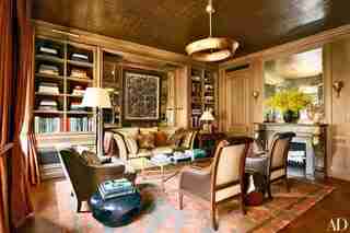
Champagne, platinum, copper, pewter, bronze, chrome, gold: Metallics are making a shimmering appearance this year. “It’s no longer about that simple, pared-down, devoid-of-embellishment Belgian look,” O’Neill says. “We’re seeing all of these colors that telegraph a trunk of riches.” She suggests bringing the bullion embroidery and gold lamé accents from the runway into the home by painting a metallic ceiling or coating a doorway or window frame in gold.

Moody
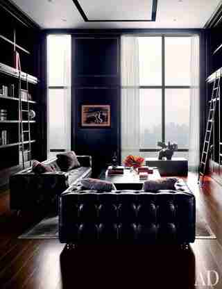
Ocher, oxblood, saffron, sapphire, Cognac, charcoal, ink, violet, moss, mulberry: “I keep seeing deep, saturated colors that remind me of a Vermeer painting,” O’Neill says. “When I was in Paris and I went to the puces , I noticed how many of the vendors’ booths were painted black and how startlingly beautiful deep, rich oil paintings were against that black wall.”

Warm
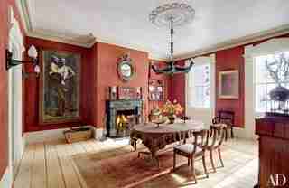
Auburn, burl, bark, clay, sepia, sable, tobacco, tortoise: “At Maison we noticed many brands celebrating terra-cotta, which used to feel so ’70s,” O’Neill says. “But of course, if you take the metallic out of copper, you get terra-cotta.” To keep things from getting too hippie dippie, she suggests cutting the earthy hues with stark white or something metallic.
Transparent
Froth, haze, Milky Way, moon, gossamer, glass, onion skin, powder, smoke, veil, blur: “At the Fondation Louis Vuitton you look through those sails and it distorts your view of the landscape like a veil. Then at Marc Jacobs and Vera Wang there was this layering and layering of tulle—it feels like this romantic idea of looking through gauze, softening the hard edges, is in the air,” O’Neill says.
Quirky
Amber and olive, concrete and coral, marble and magenta, chalk and chartreuse: “So many people are taking a material that feels very utilitarian and glamorizing it with color,” says O’Neill, who recently spotted a bright magenta Corian counter on top of a cement foundation and said, “All of a sudden that color changed your whole optic about concrete.”
Related: AD ’s Guide to Decorating with Color
Related: Explore AD 's Wall Decor Ideas & Paint Color Guide
