Sometimes you have to scrap original architectural details when you’re updating an older space, simply because they’re in disrepair. But that doesn’t mean you can’t honor the bones and era of your home with your design scheme. Take one look at the after of this 1920s period style bathroom that designer Anne Sage just created for a client (who works in historic preservation in Los Angeles, no less), and you’ll see it’s absolutely possible to make updates that modernize a space and jibe with its past.

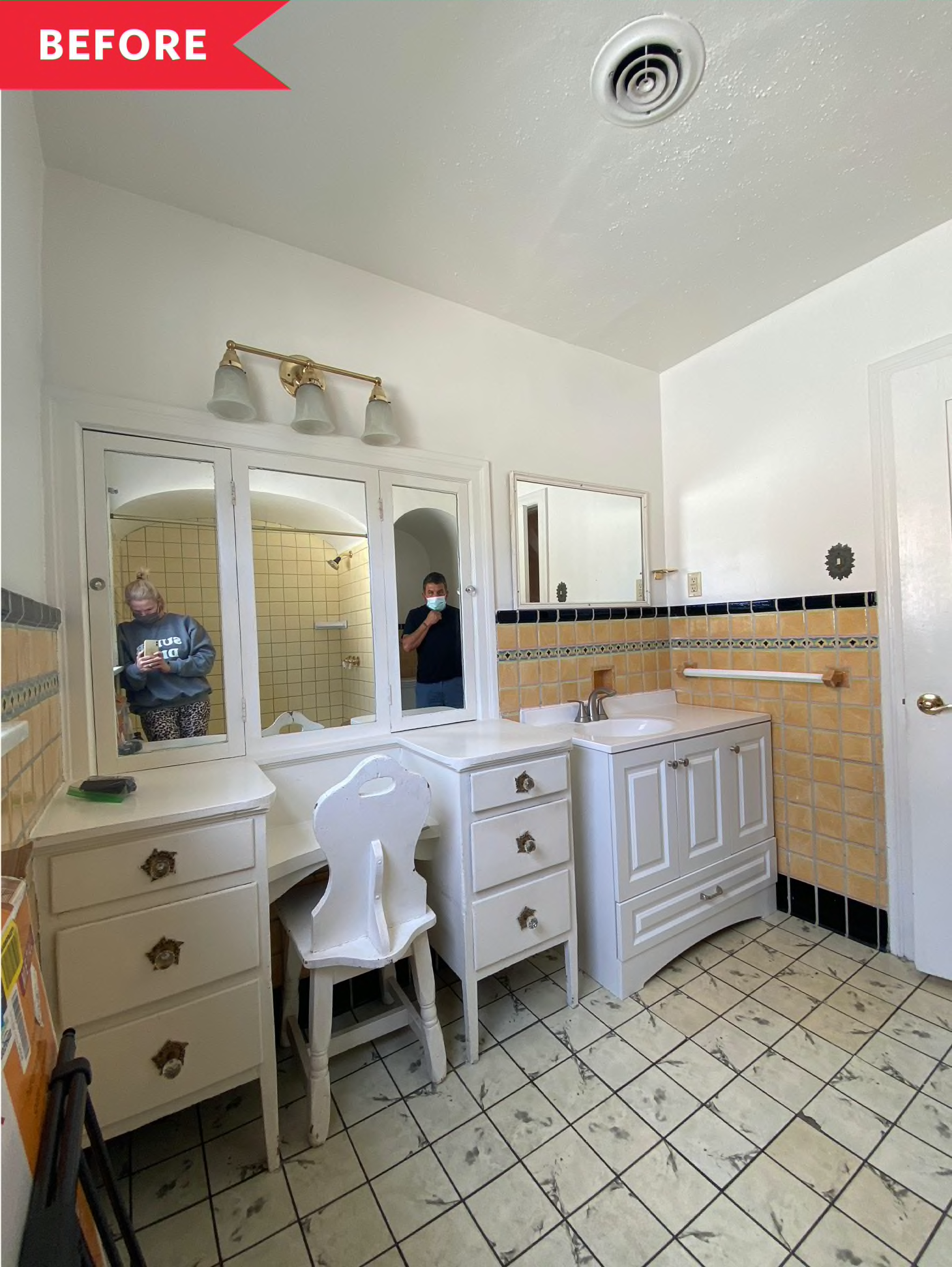
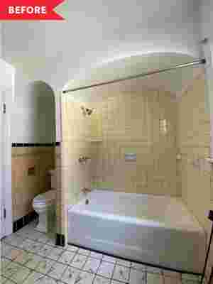
Part of a Tudor style home built in 1923, Sage’s client’s bathroom could best be described as a mismatched hodgepodge before the recent reno. Some of the tile, the arched alcoves, and the built-in wood vanity were all original to the space. A string of “unfortunate later additions” though, in Sage’s words — from dingy linoleum floors to dated tiles in the shower — were bringing down the look and feel of the bath. “Our goal was to modernize the space to make it more functional and aesthetically harmonious, both for my clients during their time in the home and to increase resale value in the future,” says Sage. “Yet at the same time, we wanted to honor the period during which the home was built by retaining some of the original character.”
To reconcile the old and new, Sage began by doing tons of research on 1920s architecture and found that arched bathrooms actually dominated the decade. That being said, Sage wanted to keep these features intact and maintain the current layout for the most part, but she wanted to restructure the arch over the tub to better match the proportions of the one over the toilet. Instead of having two pieces of furniture along the sink wall, she decided to simplify the setup with just one large floating vanity that would offer lots of closed storage and double sinks. To that end, Sage selected cabinets from BOXI by Semihandmade in the slab style in the color oat, which established a light, bright tone for the space.
Inspiration for the rest of the dreamy, desert pink palette came from the ‘20s, too, namely from Art Nouveau and Art Deco styles. A two-toned tiled wall treatment brought the wow factor to the shower surround, sink wall, and toilet nook. For the lower portion of these walls, she selected soft mauve Fireclay large subway tiles , which, though clean and contemporary, felt appropriate in their shape and hue. By bringing in Fireclay’s 1×6 Sheeted Mosaic Tile in Sand Dune for the top half of the walls, she further modernized the scheme. Even the floors got a 21st century makeover that still manages to hark back to the 1920s: hexagonal tile but oversized at 6-inches across and in shades of matte ivory and blush.
Sage sourced all of the new major fixtures — toilet , tub , and vanity sinks — at Wayfair/All Modern, and the lighting , aged brass hardware , and other storage accessories came from Rejuvenation, a leader in repro house parts and finishes. Walls were given a fresh coat of Portola Paints ’ ultra flat acrylic paint in County Line. Both the mirror and counter slab were fabricated by local vendors sourced and supervised by Pulled , a platform where you can manage and pay for all of your home projects and services. Pulled was also used for the labor contracting and subcontracting for this renovation, too.
Believe it or not, the install of the space only took two weeks from start to finish. “We had to be quick because this bathroom is the only one in the house,” says Sage. “The lead-up to the install, however, was a six month process due to the lead times we faced with our custom tile and fixtures.” Her best advice for undertaking a gut reno of a bathroom? “Definitely don’t even think about starting a project like this until all your materials are on site!” says Sage.
She also suggests holding some space for contingency funds in your bottom-line budget. “In an old home, expect a good portion of your labor costs to go towards updating things you don’t even see: pipes, subfloors, electrical wiring… in fact, these are things that tradesmen will often only provide estimated costs on until the walls are opened up, and they can assess the state of affairs,” says Sage.
For Sage though, the outcome of this reno was so worth the cost and wait, even when factoring in the standstill months waiting for product leading up to demo and construction. “We set out to create a serene, spa-like vibe that you might find in a boutique hotel, and I really think we achieved this,” says Sage. “At the same time, the space oozes that particular charm unique to the 1920s. I’m so proud of how we struck that balance between vintage and new!”
