dam-images-architects-2008-10-before_after-arsl01_before_after.jpg
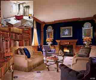
In a major feat of engineering and imagination, Geoffrey Bradfield joined the top floors of two terraced buildings, transforming them into a sleekly elegant residence for a London client. Out of a gutted space, Bradfield fashioned a “warm and inviting” library. A painting by Frank Auerbach is above the walnut fireplace. “It’s a perfect marriage with the modern mix.” (February 2008)

dam-images-architects-2008-10-before_after-arsl02_before_after.jpg
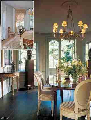
“I wanted to take it back to the way it should have been,” designer Sandra Nunnerley says of a Normandy-style house in Connecticut. “The clients are young, and I wanted the dining room to have a fresher feel,” says the designer, who removed the draperies and stained the floors. Jim Dine’s 1999 Lavender Band is at left. (May 2002)

dam-images-architects-2008-10-before_after-arsl03_before_after.jpg
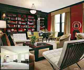
Designer Sandra Nunnerley worked with architect Arthur S. Pier to open up the living and dining rooms of a prewar Manhattan apartment for her clients, who wanted a more generous layout. (February 2007)
dam-images-architects-2008-10-before_after-arsl04_before_after.jpg
Interior designer Charles Allem gutted a young family’s Manhattan penthouse , converting it into a glamorous space that celebrates Art Déco style. A bland greenhouse-style space was transformed into a bold family room with coffered ceilings and dark walnut shelving. Picasso’s linoleum-cut Nature Morte sous la Lampe , 1962, is displayed on the rear wall. Karl Kemp Antiques armchairs. (February 2008)
dam-images-architects-2008-10-before_after-arsl05_before_after.jpg
“It was an ’80s building needing a rehab,” says journalist Dena Kaye, who, along with her partner, designer Dick Fallin, updated a house on St. Bart’s in the French West Indies. While retaining the basic footprint, the pair modernized their residence and opened it to the views. The living room previously had little relationship to the outdoors; this was remedied “by knocking down walls,” says Kaye. The couple, who designed the interiors, kept the furnishings light and understated. (February 2006)
dam-images-architects-2008-10-before_after-arsl06_before_after.jpg
“The façade was reorganized to give the house a Colonial Revival style,” says Brian Sawyer, who recently redesigned a client’s East Hampton, New York, summer retreat . Sawyer, who once worked with the legendary Robert A.M. Stern, replaced the white pickets with farmhouse rails and painted the weathered gray shingles a crisp white. (February 2000)
dam-images-architects-2008-10-before_after-arsl07_before_after.jpg
For a family’s Georgian Revival residence near Boston, designer Elissa Cullman and architect Ray Pohl refined the interiors to complement “the classical formality of the exterior,” Cullman explains. The result is “a lively style we like to call ‘young traditional.’ The challenge was working within the limited volume,” Cullman says of the master bath. Installing a barrel-vaulted ceiling added depth and interest. (February 2006)
dam-images-architects-2008-10-before_after-arsl08_before_after.jpg
The wife, says Britt, was raised in residences of his design, so she “grew up with a very visionary vision.” She and Britt were in accord about how to achieve the eclectic look she wanted . “There wasn’t a lot of deliberation,” she remarks. The kitchen and dining area were made less “raw and open” to the adjacent living area, says architectural designer Peter Napolitano. The palette and repeated elements, such as the lantern and the mirror, help maintain continuity. The elongated custom cabinetry plays off the large windows. (February 2007)
dam-images-architects-2008-10-before_after-arsl09_before_after.jpg
Designer Penny Drue Baird remade Michael and Michelle Friezo’s Bucks County, Pennsylvania, retreat , embellishing its characterless interior with elegant touches. The family room, another prior addition, lacked architectural detail. In renovation, Baird put in a limestone chimneypiece, imported from France, reclaimed-wood paneling and wainscoting. (February 2007)
dam-images-architects-2008-10-before_after-arsl10_before_after.jpg
In San Antonio, an adaptive-reuse project by Lake/Flato Architects involved transforming 1920s industrial buildings into living and studio spaces. “The pool and courtyard are meant to exude a simple, cool serenity—as an oasis in a hot, urban environment,” explains Flato, adding, “The water reflects the architecture and draws one’s eye from the interiors.” (February 2005)
dam-images-architects-2008-10-before_after-arsl11_before_after.jpg
Architects Peter L. Shelton and Lee F. Mindel, of Shelton, Mindel & Associates, undertook a gut renovation of an apartment in New York for a couple with two children. Before, the living room was boxy. A sitting area in the space features a Poul Kjaerholm bench. “The apartment is set up to give the appearance that it floats on all four sides, that it’s free around the window wall,” Shelton explains. (February 2004)
dam-images-architects-2008-10-before_after-arsl12_before_after.jpg
Ike Kligerman Barkley Architects gutted and redesigned a New York duplex for a couple. “We thought of re-creating the idea of a pre-war apartment, but with bigger windows that admitted larger views.” Principal architect John Ike explains that “the curving rear wall of the living room conceals structural columns and creates a rich variety of forms.” The mirrored columns also hide structural elements. Karl Kemp bronze platter; H. M. Luther Antiques vessel. (February 2003)
