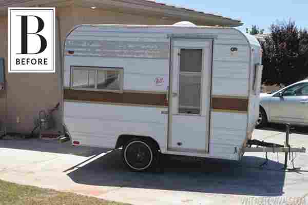
It doesn’t matter how big or how small (or how mobile) a space is — when it works, it works (better yet if you get to see what it looked like before it got to its currently amazing state). Such is the case with Mandi from Vintage Revivals’ 1973 Bell Travel Trailer makeover: A sad, dated, basically uninhabitable “before” and it’s spot-on jealousy inducing “after”.
A few shots of “The Nugget” before its owners got their hands dirty:

And now for the unbelievable After photos (and our breakdown on why it all works):
Hello?!? Of course, the backdrop is pretty jaw-dropping on its own, but how cute is this? It makes you want to troll Craigslist for your own beat up trailer to redo (the couple bought their Bell camper for $1,000). A new door with glass slats brings light into the petite caravan, and a simple but graphic paint job on its exterior lets you know you’re in for some fun on the inside.
Small but mighty (& colorful!)
It’s a truth universally accepted that teeny little spaces need to be bright to make them feel more open (though the opposite can also ring true when done right ). For her trailer makeover, Mandi went with a base of crisp white and light woods, but kept things zippy and lighthearted with bright yellow walls with a retro print and pale pink upholstery. Hints of sherbet orange bring the two nearly primary colors together.
Clever storage & decor
The limited surfaces in the little travel nugget meant Mandi and her husband had to get creative. I’d like to divert your attention to exhibit A: The built-in plant shelf above the dining area. Cheap, easy and clever, this is a great little trick should you want to add some greenery (or herbs!) to a space lacking in countertops or tabletops. Also of note is the nearly flush-mount chandelier that still feels quite special and brings in a stylish element. Finally, take a look at the curtain rail above the windows. Finding rods to fit this unique space might have proven difficult (the same goes for actual draperies). Instead, the couple created their own solution of copper pipes mounted to the wall, and looped leather with eyelets to hold a rolled piece of fabric.
Lots of white, but plenty of textures
There’s no denying that white is a powerful design tool, but the key to creating a space that still feels personality-filled (when being mostly white) is texture. What does that mean exactly? Well, in this instance, it’s the penny tiles used as the kitchen backsplash and the paneled cabinet fronts. The tiles catch light so, while they looks neutral and unobtrusive, they also have dimension. The same goes for the doors of the cabinetry. As the walls are white, and the door fronts are white, the only thing that makes them stand out (besides the brass hardware) is the subtle paneling. These are great examples of how little details can really make a big difference.
For more “Before” and “After” images as well as DIYs and trailer buying tips, hop on over to Vintage Revivals to see it all!
