Vaulted ceilings, already open-concept living spaces , and a huge yard were some of the main draws for a couple who was planning to relocate from Portland, Oregon. The 1966 ranch-style home in Austin’s Garrison Park neighborhood would be a great fit, but they realized the kitchen would need a massive remodel. So the couple called on Erin Hanrahan of Hello Kitchen , a kitchen renovation company started more than a decade ago by Austin architect Cindy Black, to turn their closed-off kitchen into an airy, elevated retreat. “The potential was endless,” Erin says. She just had to make it work.

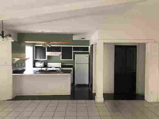
BEFORE: The kitchen had good bones , but everything would need to be gutted.
Kitchen location : Austin, Texas
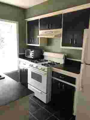
The “before” : The kitchen was very dated and closed-in. “It was a mess, a nightmare,” Erin recalls. It featured overhanging cabinetry , green paint, black laminate countertops, and dark flooring, which made it feel even more claustrophobic. Its one saving grace? A decent layout.
The inspiration : “They wanted a comfortable but high-end look for the kitchen, very refined with clean lines,” Erin says. She also looked to McGee & Co. and Amber Interiors projects, plus Pinterest and Houzz inspiration.
Square footage : Around 100 square feet. In order to expand the kitchen, Erin removed the existing laundry unit in the pantry, knocked down the wall, and expanded the kitchen length-wise. She also refinished all of the flooring, painted, and added new lighting throughout the home.
Budget : $30,000

BEFORE: The color combos in the original design left the kitchen feeling drab and cramped.

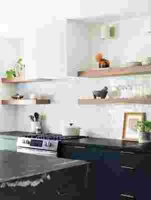
AFTER: Stained poplar wood, an affordable plywood, was chosen for the open shelving, while thrifted art from Santa Fe provides much-needed pops of color.
Main Ingredients:
Flooring: Big Horn by Regal Hardwoods
Paint color: Sherwin-Williams Greenblack
Countertops: Soapstone from AAAStoneworks
Backsplash Tile: Zia’s Zellige Tile
Lighting: Allegheny Indoor/Outdoor LED Sconce from Schoolhouse Electric
The fridge marks where the laundry room used to be. By knocking down that wall, Erin was able to add three feet of space to the new kitchen.
The clients were drawn toward classic, traditional details with modern touches, plus a neutral palette and raw, organic materials.
Most insane splurge : “ Soapstone was at the top of the must-have list,” Erin says. The splurge was specifically the waterfall edge, which is one of her favorite parts of the kitchen. “It adds a bit of drama to the space,” she adds.
Sneakiest save : The brass pull cabinetry hardware is actually from Amazon.
The best part : Besides the waterfall-edge countertop, of course, Erin loves the overall classy and timeless feel of the kitchen, which was fully accomplished with modern, natural materials.
What I’d never do again : “I would never cut costs on construction,” Erin says as a general tip. In this particular project, the clients chose a cheaper contractor, which ended up being a giant headache, before going back to her original referral.
Final cost : $30,480
When choosing a countertop, soapstone was an obvious pick. “I appreciate soapstone for its durability for being a natural stone,” Erin says. Plus, this particular slab is darker which highlights its white veining.
